
Case Study
Customer Experience and Product Design for Etoile Web Design
Team
-
2 full-stack developers
-
2 customer support specialists
-
1 designer
Tools


Challenge
Etoile Web Design sought to boost user adoption and retention across their suite of 9 WordPress plugins while reducing the burden of repetitive support inquiries on their small but mighty dedicated support team. The challenge encompassed optimizing the entire customer experience ecosystem – from initial discovery on the WordPress marketplace through the purchasing process on their website to implementation and ongoing use within client domains.
Approach
I led initiatives to enhance the overall customer experience through improved audience understanding and streamlined UX/UI design. By analyzing brand challenges and user needs – we learned more about the customer base and ideated multiple solutions to roll-out incrementally over 18 months in order to reduce support demands empowering both customers and the support team.
A comprehensive survey of 275 customers revealed critical insights that drove strategic product improvements: shifting to less technical language after surprisingly discovering 70% of users aren't developers, streamlining the purchase process to reduce the 16% of interested buyers who couldn't complete transactions, and prominently featuring demos, screenshots, and money-back guarantees – all of which were discovered as the top factors influencing premium license decisions.

Through comprehensive customer journey mapping, we identified technical content areas that needed simplification for non-developer audiences and created a holistic user flow that delivered appropriate, understandable language at every touchpoint across marketplace, website, and plugin interfaces. Key benefits included: eliminating cognitive overload through consistent language and menu options across all plugins, enabling knowledge transfer when users installed multiple plugins, and streamlining future content testing and support documentation creation through standardized terminology that improved keyword search-ability.
Our solution involved restructuring information architecture to reduce user confusion, implementing cross-plugin consistency so users wouldn't feel like they were starting over with each new installation, and strategically adding contextual tooltips based on common support questions to assist users who needed extra guidance without disrupting the experience for those who didn't require additional help.

Highlights
-
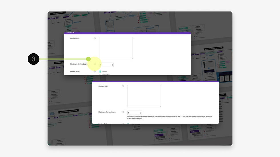
Minimalistic style guides created ad-hoc as I worked closely with dev to implement iterative UI design improvements.
-
A small series of helpful tips added to the product interface for frequently asked questions.
-
Tooltips added for every item added as a fast solution for all less technical users – to be determined in the future which are not necessary as more data rolls into support and more help documentation is produced.
-
A clear path to purchase was added throughout the interface for non-premium users.
-
Premium features clearly on display within context for non-premium users – helping to clarify what were commonly asked questions to support about premium features specific abilities requiring manual effort to respond.


Key Solutions
The primary product enhancement focused on visually showcasing premium features within free accounts, allowing potential premium users to see real-time value in their current projects. Additionally, we addressed a significant user experience friction point where trial users struggled to locate where to input their email-delivered key codes. To resolve this confusion, we implemented intuitive lock and key graphics in both the email communications and on-site interfaces, creating clear visual pathways that guided users to the appropriate input locations.
Impact
These strategic improvements delivered measurable results across multiple key performance indicators. Organic traffic increased by 15% through improved keyword optimization, while plugin sales pages saw a 20-30% decrease in bounce rate due to higher quality content informed by customer feedback. Overall website bounce rate dropped by 17%, and user experience was further enhanced by a 2.3-second reduction in average page load time through graphics optimization.
Most notably, the visual guidance system for key code entry resulted in a noticeable decrease in support tickets related to trial activation, reducing the burden on customer support while improving user satisfaction.


Year
2017